4 Ways to Optimize Your Mobile Landing Pages for Conversions

Mobile visitors are goal oriented. When they click through to your site, they want to understand what’s being offered quickly and easily. And you can clearly communicate that to them through the use of mobile landing pages.
More importantly, landing pages give you the opportunity to both create personalized content and test the efficacy of that content without having to make any major overhauls to your website. However, when building and designing landing pages it’s essential that you put yourself in your visitor’s shoes. What can you do or what can you offer to improve their experience?
Here’s our list of four simple ways to optimize your mobile landing pages for conversions.
1. Emphasize Your Unique Selling Proposition
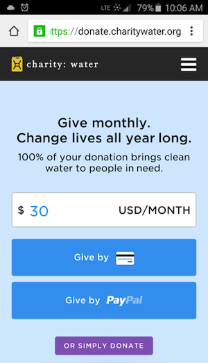
When visitors land on your site, the first question they should be able to answer is “what’s in it for me?” This is your unique selling proposition (USP). This should be clear, direct and compelling for your visitors. For example, at AddThis we’ve used the USP: “Promote Your Site with the Best Social Tools on the Web.” Nonprofit Charity Water uses the USP: “Give Monthly. Change Lives All Year Long.”
The less copy you can use to define your USP, the better. Aim for a headline that’s less than 6 words. According to Kissmetrics, usability research indicates that when people scan headlines they’re only registering the first 3 words and last 3 words. Therefore, by keeping your headlines to 6 words, you’re ensuring that it all gets read. To make scanning even easier, you’ll also want to make sure that your headline stands out. On the actual page, make sure it’s large and placed front and center.
2. Explain the Benefits of Your Product or Service
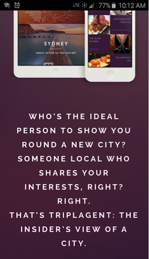
There are two easy ways you can highlight the benefits of your product or service, one of which is through catchy description text. You’ll want to include this text near your USP—helping provide clarity for visitors who still need more information about your business and your offering. A word of caution: less is more. Your copy should be easy to scan. No one is going to read long sentences in fine print. At AddThis, we narrowed a robust platform with different offerings into one sentence: “Promote Your Site with the Best Social Tools on the Web.” Travel company TriplAgent uses the following as their description text: “Who’s the ideal person to show you round a new city? Someone local who shares your interests, right? Right. That’s Triplagent: The Insider’s View of a City.”
The second way to help convert visitors is to use social proof. This can be in the form of testimonials. One note of caution, make sure that your testimonials are short and easy to scan. You can also rely on trust badges, security seals, and logos of news sources that have covered your product.
3. Use Compelling Images
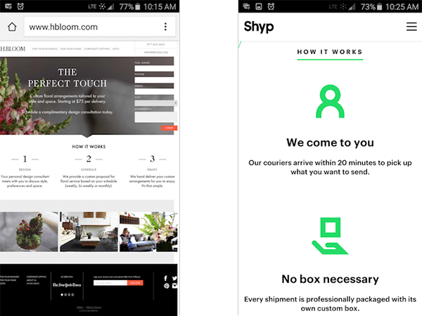
If you’re having a hard time cutting down your copy, try using a picture instead. Your photo should be relevant and should show or represent your product or service. Try to avoid using stock photography. It has the potential to come across as cheesy. There are lots of great free photo sites online you can use to get started. If you don’t have a product to showcase, consider using a process diagram. It will visually explain to your audience what they can expect. If you have neither a product or process to feature, show yourself and your employees in a photo. Luxury florist H.BLOOM uses stunning images and delivery service Shyp leverages simple icons to explain their process.
4. Create a Clear Call to Action
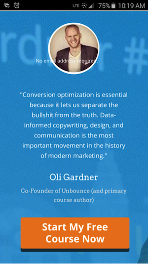
Your mobile landing page should have one clear, compelling call to action (CTA) for your audience. In order to be successful, CTAs should be both valuable and relevant. Examples of compelling CTAs include “get started today,” “start my free course now,” and “join the revolution.” Also, make sure to remove any other external links on the page so that there’s no competition with your CTA.
Other design tips to create an engaging website include using buttons to make your CTA stand out and that avoid making your visitors have to zoom-in on your page. To draw the eye, use complementary colors to your backgrounds. Also, warm colors—such as reds, oranges and yellows—inspire action. These are just a few of ways to make your web design engaging.
If you are asking your visitors to fill out a form, make that exercise as easy as possible. For example, allow them to connect to a social account to avoid having to fill out a form. At AddThis, we allow visitors to sign up using Google+, Facebook or Twitter to make things easier. If you have a WordPress site, there’s a simple social connect plugin you can install to make this sign in option available to your visitors. For other sites, One All has an app that will help you integrate social sign in on your site. If you do require them to fill out a form, ensure that you remove all unnecessary form fields.
Lastly, consider including a clickable phone number or email address. You want your visitors to be able to easily contact you.
Simplicity is the key to designing mobile landing pages optimized for conversions. Give your visitors a clear, compelling offer and make it as easy as possible for them to complete the necessary action. According to a study by Chartbeat, visitors only spend an average of 15 seconds reading your page—so make sure you have your priority information and call to action front and center.
Via AddThis