
Embed comment from Facebook into your site

In a previous article, I’ve guidance you create and get app ID from Facebook. Now I will help you embed comment function Facebook into your site.
Actually, In Shopify Apps Store have many app free help user add comment function into your site. But If you don’t like them you can add comment from Facebook.
Here we go.
Step 1: Include the JavaScript SDK
- Go to the Edit HTML/CSS page.
- Under the Layout folder, locate and click the theme.liquid file to open it in the online code editor.
- Look for the <body> tag and add the following code under it:
1 2 3 4 5 6 7 8 | <div id="fb-root"></div> <script>(function(d, s, id) { var js, fjs = d.getElementsByTagName(s)[0]; if (d.getElementById(id)) return; js = d.createElement(s); js.id = id; js.src = "//connect.facebook.net/en_US/sdk.js#xfbml=1&version=v2.3&appId={{settings.shopifytips_facebook_app_id}}"; fjs.parentNode.insertBefore(js, fjs); }(document, 'script', 'facebook-jssdk'));</script> |
Step 2: Add to your Customize theme page
- On the Edit HTML/CSS page, locate and click Config.
- Under the Config folder, locate and click the settings_schema.json file. This will open the file in the online text editor.
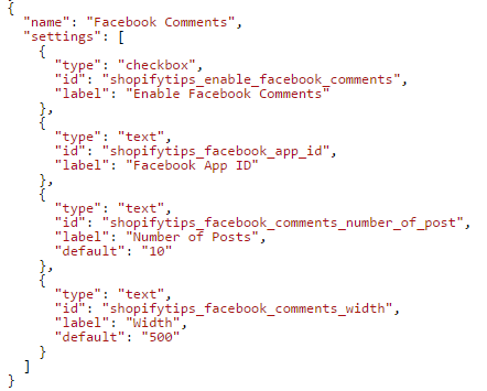
- Scroll down to the very bottom of your settings_schema.json file and add this code before the last square bracket ] and after the last curly bracket } – make sure to include that first comma , since you’re modifying a JSON data structure:
1 2 3 4 5 6 7 8 9 10 11 12 13 14 15 16 17 18 19 20 21 22 23 24 25 26 27 28 | , { "name": "Facebook Comments", "settings": [ { "type": "checkbox", "id": "shopifytips_enable_facebook_comments", "label": "Enable Facebook Comments" }, { "type": "text", "id": "shopifytips_facebook_app_id", "label": "Facebook App ID" }, { "type": "text", "id": "shopifytips_facebook_comments_number_of_post", "label": "Number of Posts", "default": "10" }, { "type": "text", "id": "shopifytips_facebook_comments_width", "label": "Width", "default": "500" } ] } |
- Click Save.
Step 3: Place the code for your plugin
- On the Edit HTML/CSS page, locate and click Templates.
- Under the Templates folder, locate and click the product.liquid file. This will open the file in the online text editor.
- Place the code for your plugin wherever you want the plugin to appear on your page.
1 | {% if settings.shopifytips_enable_facebook_comments %}}<div class="fb-comments" data-href="{{shop.url}}{{product.url}}" data-width="{{settings.shopifytips_facebook_comments_width}}" data-numposts="{{settings.shopifytips_facebook_comments_number_of_post}}"></div>{% endif %} |
Depending on the theme you are using maybe you need open product.liquid (in Templates folder) or anything file in Snippets folder place for place this code
- Click Save.
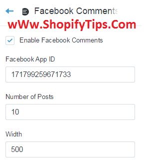
Step 4: Configure your plugin
You can now configure your plugin using your Customize theme page:
- Go to the Customize theme page.
- Configure your plugin in the Facebook Comments section:
This article just stop at basic level. If you want your plugin become professional, you need read more document about API of Facebook in here: https://developers.facebook.com/docs/plugins/comments.
Good luck for you.
Huynh Mai Anh Kiet


Hi! I really like your blog, I love the way you wrote this content. Thanks for sharing such great information with us.
While I think there are good reasons why responsive design isn’t a good option, I don’t think you hit on them here. Let me reply to each of your five points:
1. Defeats user expectations. In the example you showed, this is how that one designer created their site. They choose to move the navigation and sidebar. However, that is like saying desktop design doesn’t work because someone poorly designed it for the desktop. I could point out hundreds of bad designs for responsive design, but that doesn’t mean responsive design in general is not effective. 2. Costs more and takes longer. Yes, yes it does. But are you going to just be lazy and not optimize your website for what your users are browsing your site on? If you do not have users viewing your site on anything but a desktop, using responsive design does not make sense. But if you need a mobile optimized site, responsive design is the answer as it allows you to target all browser sizes verses adaptive design that only allows you to target one. 3. Non-Responsive Designs Usually Work. Personally, I HATE using my phone sideways unless its for a specific app. Otherwise, I always use my phone vertically, especially for browsing the web. So you are going to tell me that its a better design and user experience to make me turn my phone side ways to view your site? And that showing me the font size super small is user friendly? No way. 4. There is Often No Load Time Benefit. This is probably your best point, but it really depends on how a user designs the site. By not doing anything with media queries, your logo will become pixelated on my retina devices and decreases the value of your brand. Developers can optimize the site for smaller screens with responsive design, though some choose not to. 5. It’s a Compromise. I usually quickly browse away from a site on my phone if they aren’t optimized for it. I hate being forced to zoom in and then have to scroll horizontally to view a paragraph of text. That is very un-user friendly. Have you even read Responsive Web Design by Ethan Marcotte or Mobile First by Luke Wroblewski? It does not seem like it.