
4 Amazing Free Online Tools You Should Use To Make Websites Mobile-Friendly

One of the most significant technologies in human history is the smartphone. The usage of mobile devices has dramatically increased during the last several years. Mobile phones are becoming the most practical choice for consumers for everything from internet surfing to shopping online.
It is now appropriate for businesses to execute a mobile-based strategy. That includes making the switch from conventional websites to those that are responsive and mobile-friendly.
Why is having a mobile-responsive website crucial for businesses?
More than 52% of website traffic comes from mobile devices. Additionally, about 61% of customers are more likely to make a purchase from a website that is mobile-responsive. So, businesses should have a mobile-responsive website in order to get a competitive edge and thrive in the market.
What makes a website mobile-optimized?
The following categories must be taken into consideration while creating a mobile-friendly website:
- Mobile friendliness: Can consumers simply navigate your website on mobile devices?
- Website loading time: Is your website loading fast on mobile devices?
- Responsiveness of your design: Does the design of your website adapt to different screen sizes?
- SEO: Does your website meet requirements set forth by search engines for mobile responsiveness?
- Mobile Website Analytics: Are you keeping an eye on how well your website performs on mobile devices and making improvements when necessary?
There are 4 tools you should use to make websites mobile-friendly
There are several online tools on the internet that may assist you to determine whether or not your website is mobile-friendly. To ensure that you don’t lose your audience, use these to optimize your website.
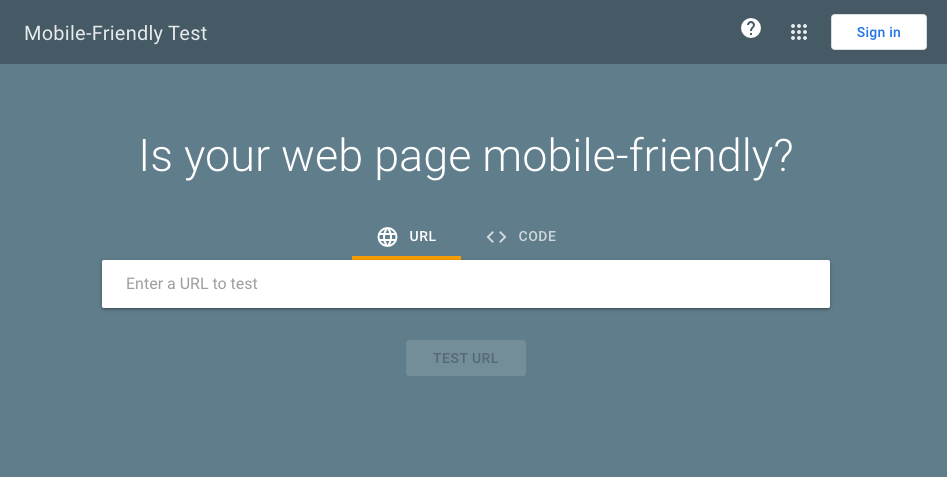
1. Google’s Mobile-Friendly Test
You may use the free tool known as the “Google’s Mobile-Friendly Test” to find out how well your website performs in terms of Google’s search algorithm. The convenience of your site’s mobile version to users is determined by a set of parameters offered by Google.
2. Google PageSpeed Insights
PageSpeed Insights, another Google service, aids in determining your website’s speed.
It is a free tool that evaluates your website and enables you to determine how quickly it loads on desktops and mobile devices. It also offers advice on how to make your website load faster.
Try GTmetrix if you want a more in-depth report. Although the tool’s basic features are available for free, you must pay for the premium alternatives to get the tool’s thorough reports.

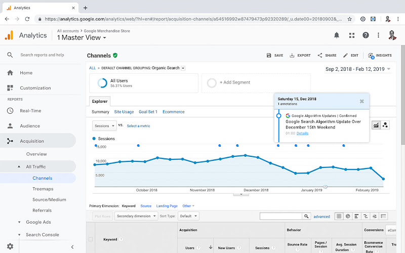
3. Google Analytics
Another Google free tool that can be used to determine how smartphones are contributing to the performance of your website is Google Analytics. You can gauge mobile website usage using its Mobile Overview function. The program also enables you to trace sources, discover mobile conversions, and do a lot more.
This program is also free, and you may use all of its greatest features without spending a single penny.
4. Responsive Design Checker
Using the free Responsive Design Checker tool, you can determine whether your website is responsive across a range of devices. It saves you the time and money it would take to personally test it on various devices.
The tool is easy to use. Select the device and enter your link. You will see your results on a screen.
For instance, input the link to your page and choose the Apple iPad Pro from the predefined list of devices to test the responsiveness of your website on the Apple iPad Pro. After that, you may view how your website appears on the chosen device.
If your selected device isn’t included in the list of pre-defined options, you can manually specify the pixel size.